

STRATEGIC COMMUNICATION PORTFOLIO
2019 Year-End Fundraising Campaign
Focusing on steps our audience can take to address insect declines, we mobilized donors for the organization’s then-highest-grossing year-end fundraising effort.
STRATEGY
A unifying message, tangible results, compelling imagery, and careful pacing drove the success of this fundraising campaign.
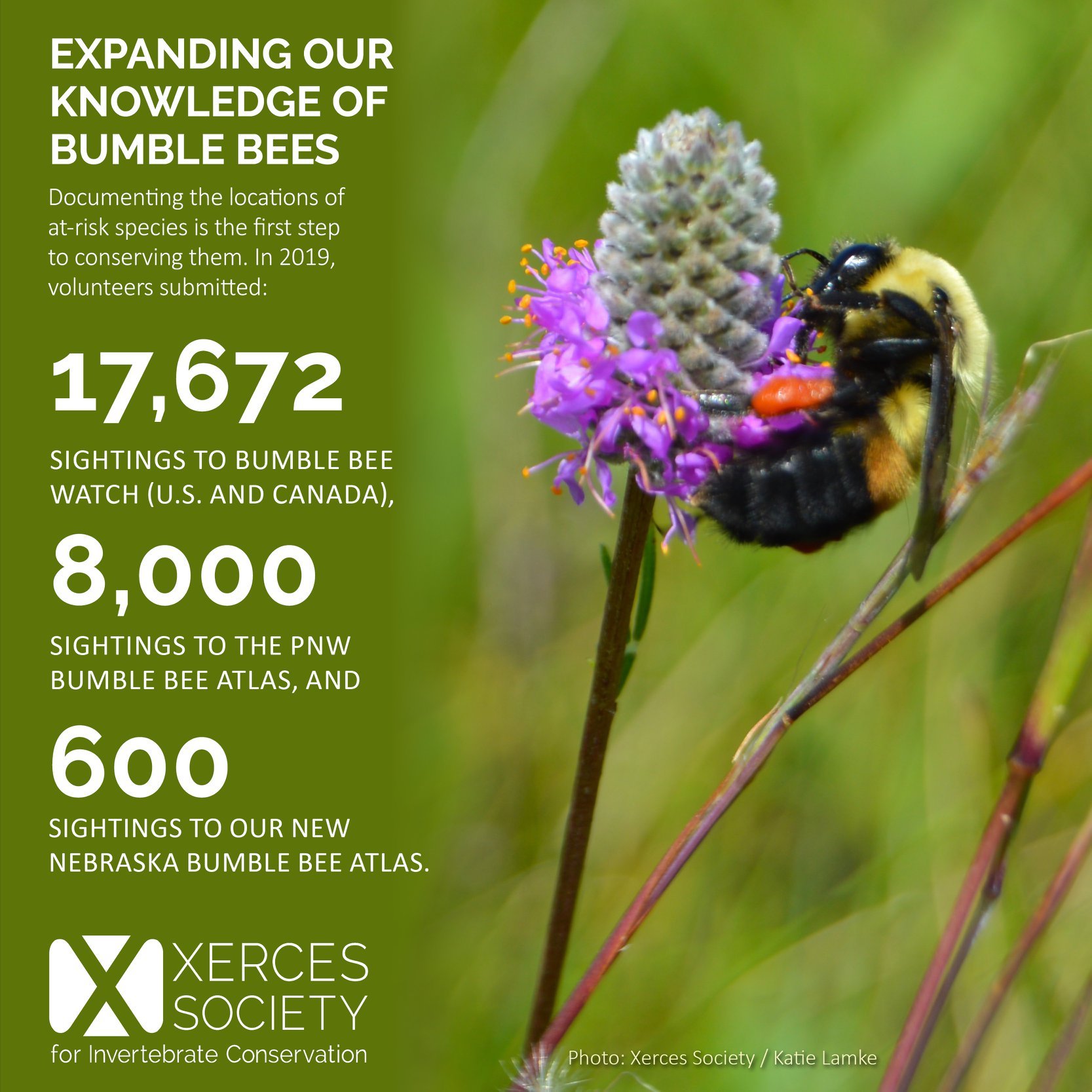
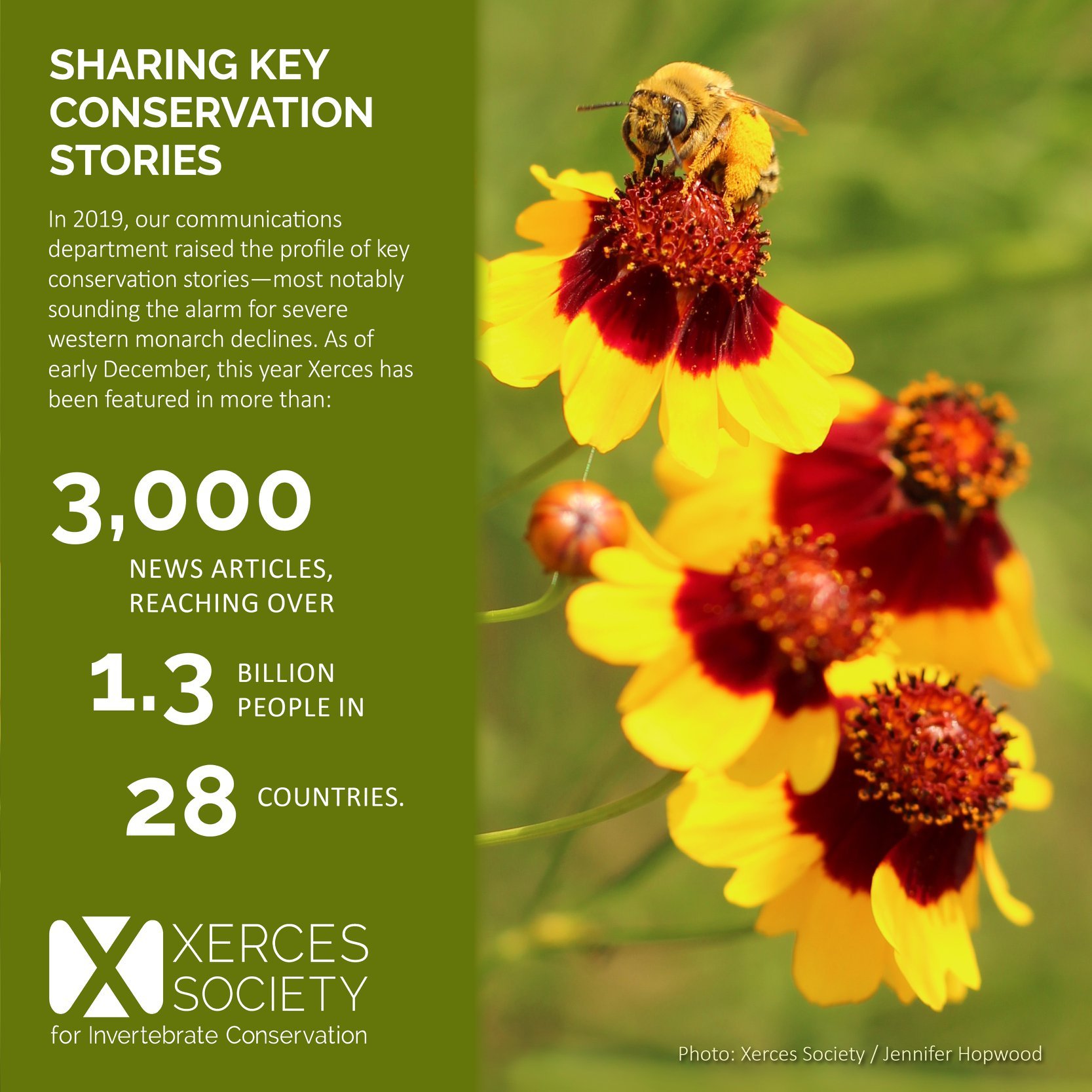
In some ways, this was a year-end nonprofit fundraising campaign like any other. Drawing from our annual report, we shared a lot of by-the-numbers summaries of our accomplishments in 2019 and asked our audiences to donate so that we could continue that work in 2020. Unlike other years at Xerces, we organized all collateral around the need to address global insect declines. Having this unifying principle sharpened our audiences’ interest in donating.
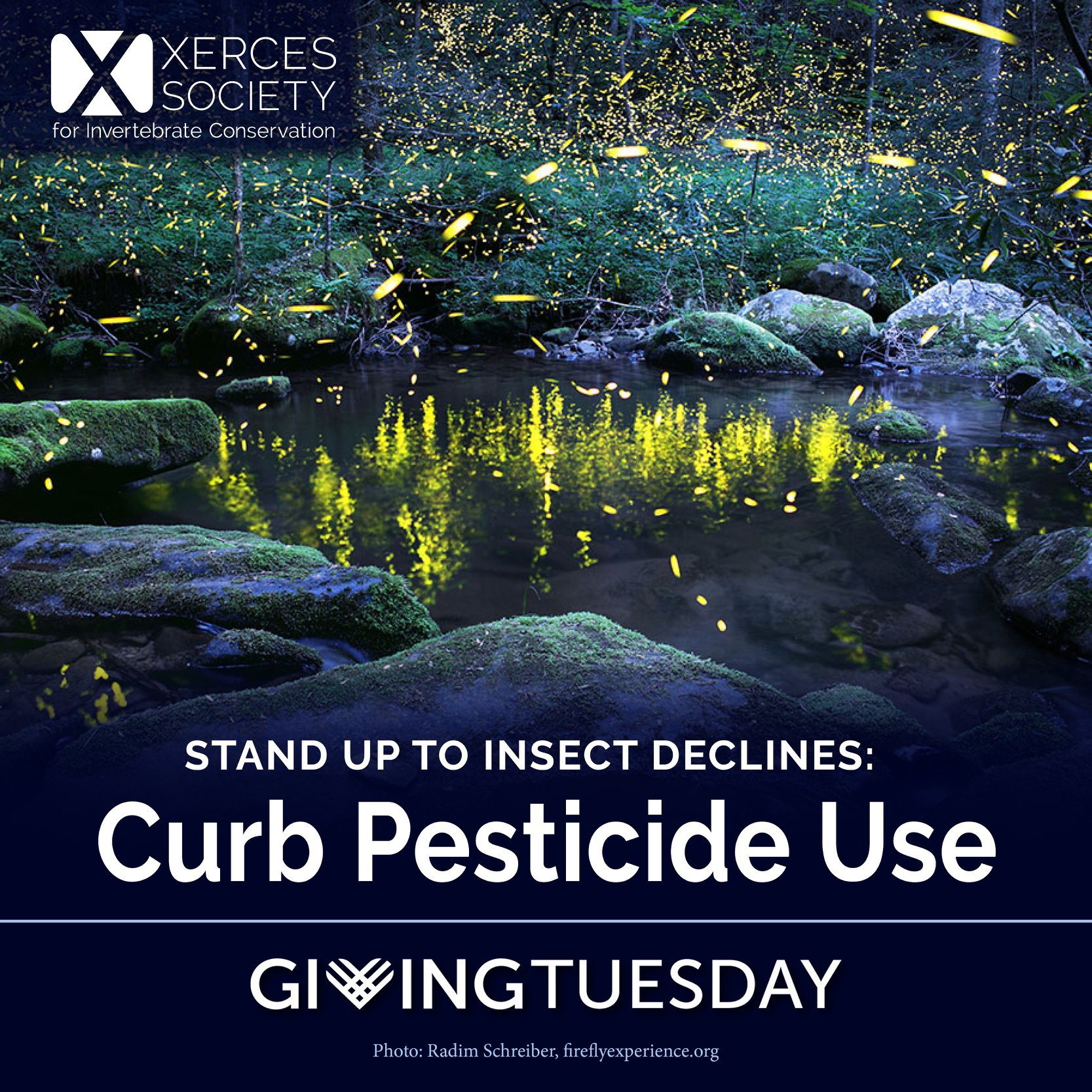
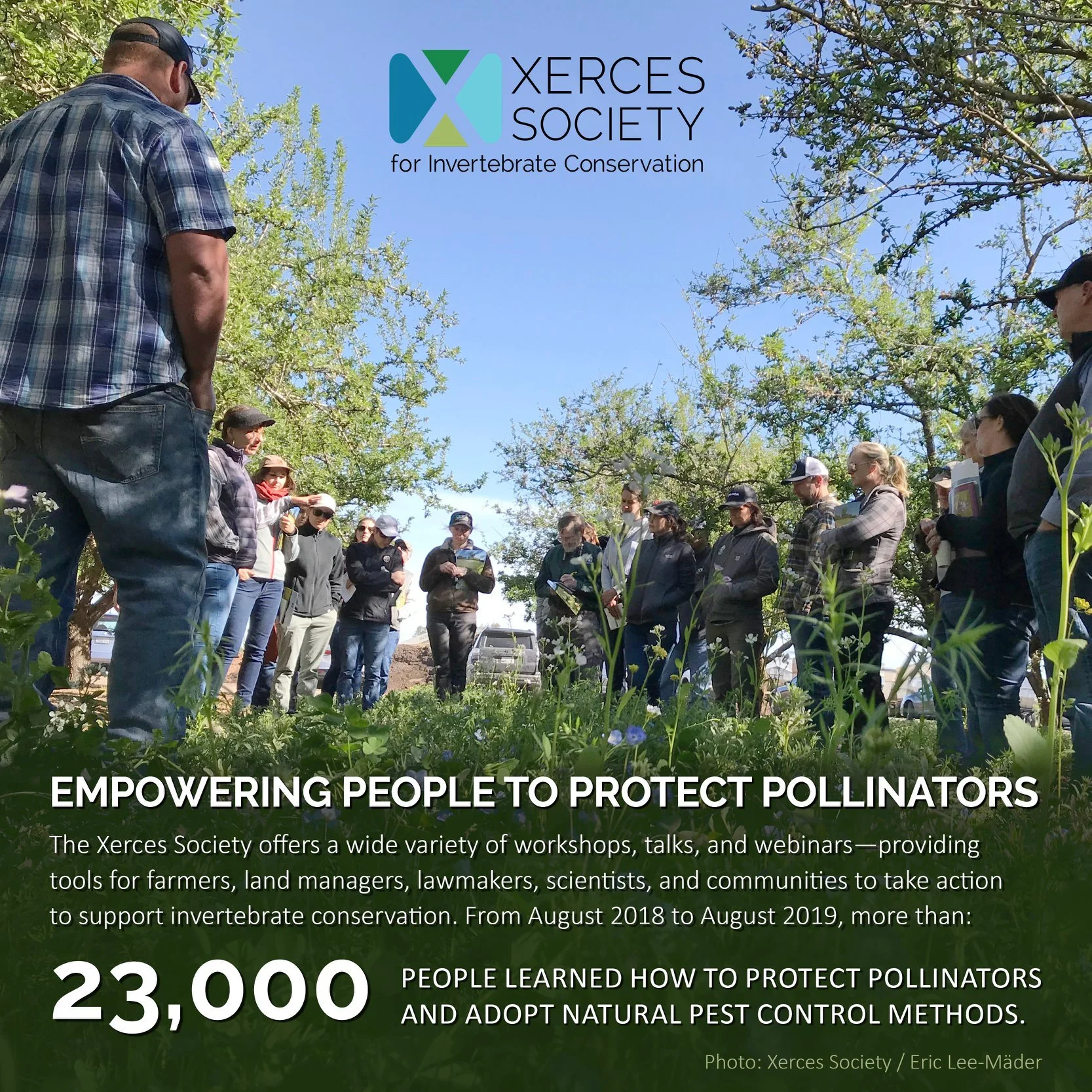
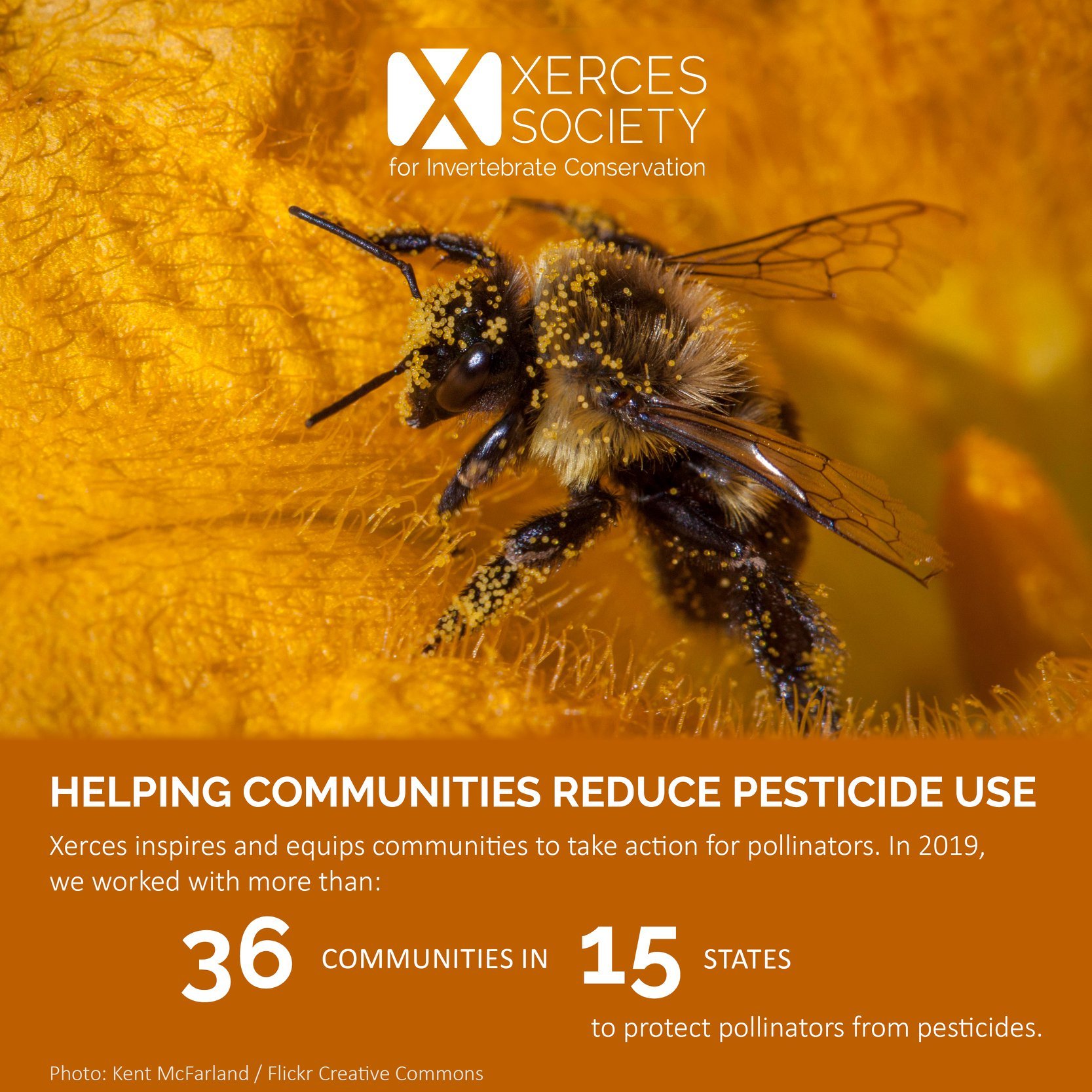
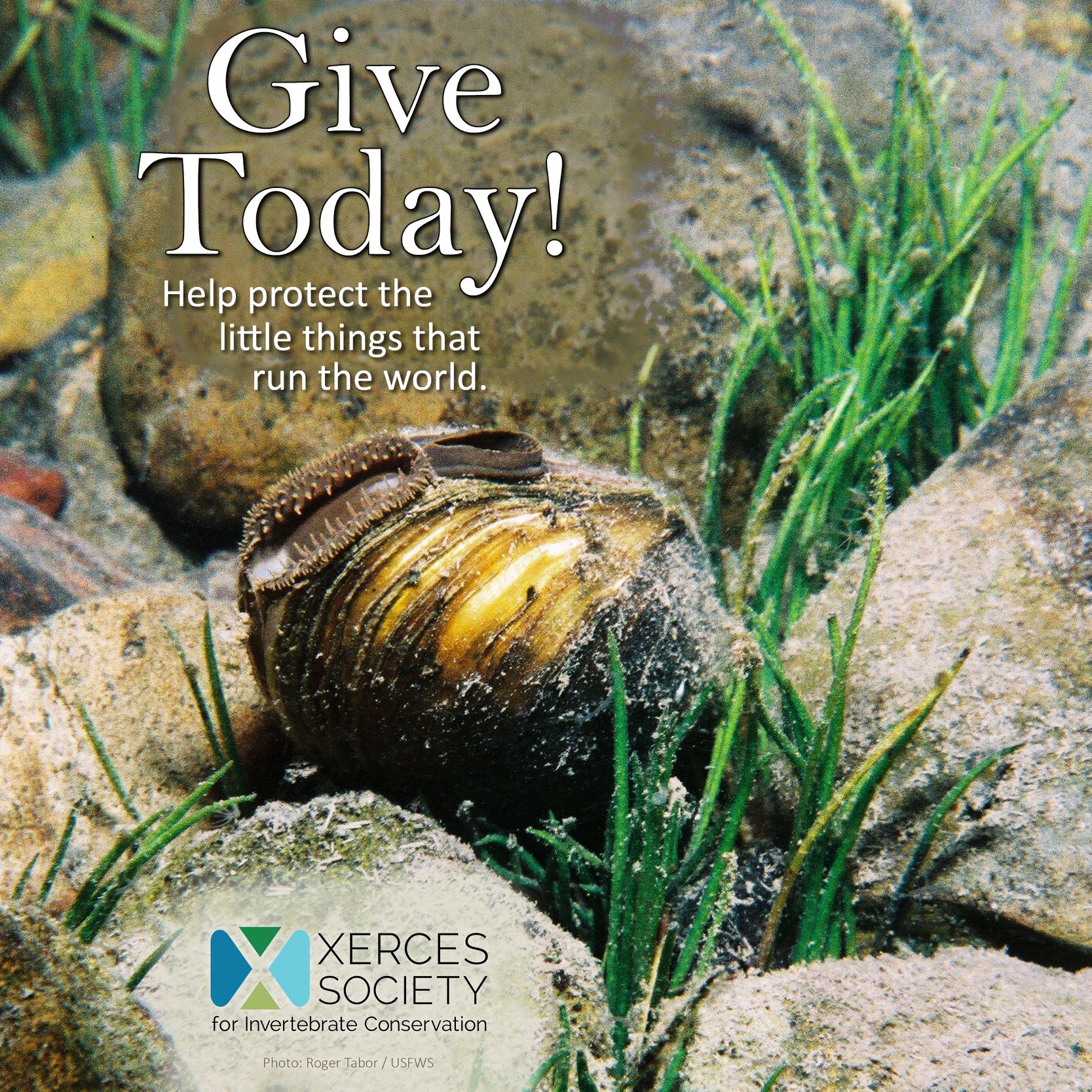
Selecting tangible actions that benefit imperiled insect populations was a crucial facet of this campaign. On Giving Tuesday, we opened with three concrete ways to “stand up to insect declines”—create habitat, curb pesticide use, and engage your community. Anchoring these action items were vibrant, technically sound photos from the field. We wanted to kick off the campaign with as much visual appeal as possible.
This was supported by my year-long work on the Xerces digital asset library, organizing our considerable image resources so that they could be more easily searched and utilized by staff, not to mention the generosity of my colleagues and outside partners, who regularly contributed photos from their field work. Having open lines of communication regarding our photo needs (including how to improve the technical aspects of photography) was a key part of this effort! Ultimately, the fundraising team and I carefully curated the strongest assortment of images, with some unifying hues throughout the series. All of these factors made our 2019 year-end fundraising campaign a visually rich one—which enhanced engagement across all digital platforms.
Finally, my construction of a well-paced seasonal social media calendar ensured that we would not alienate our audience before the fundraising campaign was concluded. It is always a delicate balance, asking for donations just often enough that it remains top-of-mind for your audience, and not doing it so often that you are unfollowed and ignored. I guided us to the right mix of fundraising posts and other content, and spread it strategically through November and December for maximum effect.
Ultimately, this campaign yielded the then-highest-grossing year-end fundraising effort in the organization’s history—the second in a row, and making me 2-for-2 during my tenure at Xerces!


DESIGN
Anchored by excellent photography, these images are unified by a secondary/tertiary color palette, consistent typography, and the rule of thirds. Simple design for maximum impact!
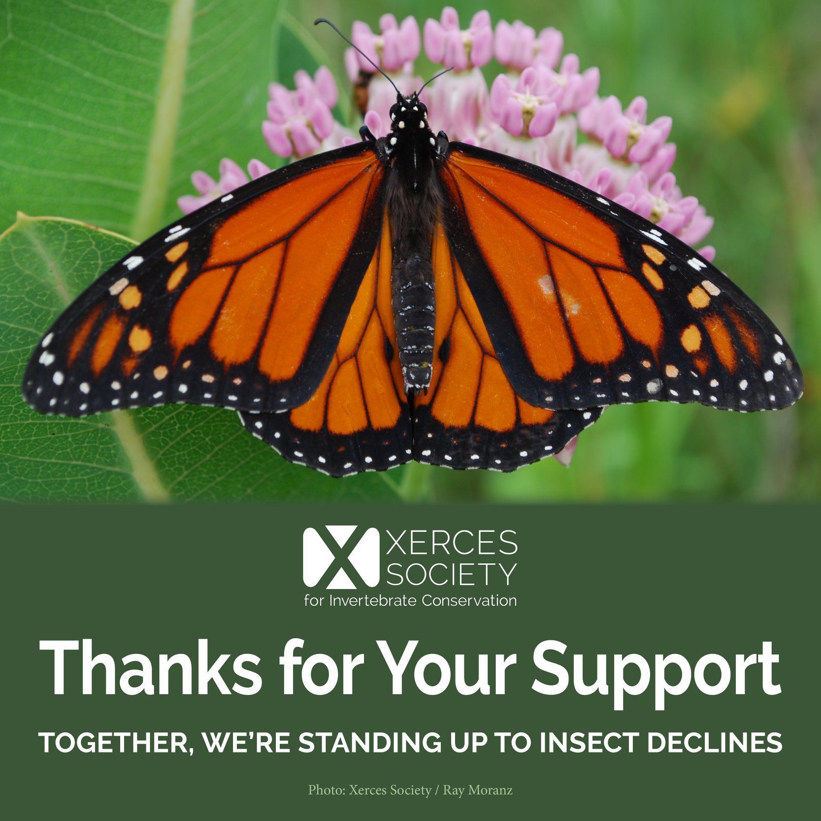
I created all imagery for this successful year-end fundraising campaign. The unifying principles of this campaign’s design language were strategically simple, yet profoundly effective. The fundraising team and I carefully curated the photos we were going to use, selecting not only the strongest images, but also a suitably broad array of species to show the breadth and depth of our work.
Then, we engaged in a second round of reviews to ensure that the images fit together visually. Ultimately, we arrived at a collection of photos with vivid secondary and tertiary colors—oranges, greens, purples, and their derivatives, like blue-violet and yellow-orange. (Color theory, y’all!) Otherwise known as jewel tones, this palette is inherently eye-catching and simultaneously feels naturally derived (and it was!). From there, I carefully sampled hues from each photograph to create color-coordinated overlays for titles, logos, and body text. Each graphic’s composition was unified by intentional color use, just as the overall series was.
It is often true that the cleanest, simplest designs are the most thoughtfully composed. That was certainly true for this campaign. I deliberately kept the rest of the design simple so that the strong photography could shine through. All text and logos were white, in contrast with the vibrant tones of the photos. I used only two typefaces—one incredibly sparingly—and only two different text treatments. I also had to carefully corral the text’s footprint—often year-end summaries of our accomplishments could get verbose, understandably so! So, this required revision of the source text to ensure concision, as well as careful arrangement of design elements.
I employed the rule of thirds (and sometimes fifths) to arrange each social media graphic in a visually appealing, organized manner that kept the focus on the photographic image. Text was relegated to a small band of the square canvas, offset from the vertical and horizontal midlines to create visual interest.